

What a Multidisciplinary Clinic Website Actually Needs
What we learned building a 12-page WordPress site with HotDoc booking for a Melbourne medical centre, and what I would tell other clinics.
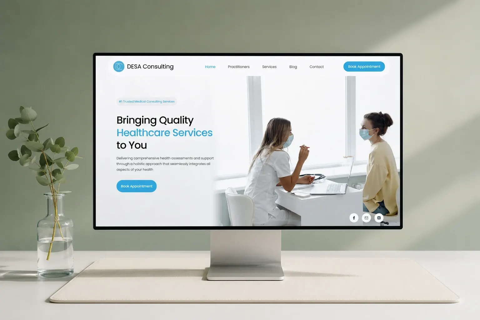

Indore, 1 November 2026, the first website WakeUp Monster ever built was for a medical centre, and most of what I think about clinic sites comes from that project. The client was DESA Consulting, a multidisciplinary medical centre in Melbourne offering NDIS support, orthopaedic surgery, counselling, weight-loss programs and allied health.
DESA was also our first client. Before WakeUp Monster I was a senior developer at an established agency, and DESA's founders were clients there. They weren't happy with the quality they were getting. When I left, they came to work with me directly, before I had a portfolio or a single case study to show them. They trusted the person, not the logo. I felt that weight on every decision.
What we delivered was a 12-page WordPress and Elementor site with HotDoc online booking, built by a team of four in under three months. It is live and brings patient appointments in through HotDoc. The short version is on the DESA Consulting case study. This post is about the reasoning.
Booking should be one or two taps away on a phone
Most people looking for a clinic are on their phone. Often they are in pain, or worried, or booking for a parent or a child. Nobody in that state reads the About page first.
So the thing to design first is the path from any page to a booked appointment, and the homepage comes after that. DESA uses HotDoc, which a lot of Australian patients have already used somewhere else. That helps. Our job was to keep the route to it short.
My advice to any clinic: put a booking link on every service page and every practitioner page, and keep a booking button within easy reach on mobile. If someone lands on a counselling page from a search, they should not have to go back to the homepage and hunt for it. Repeating the button feels clumsy in a design review. I would still rather repeat it ten times than lose one patient halfway.
Practitioner pages matter more than people think
In a multidisciplinary clinic, patients often choose a person rather than a service. They saw someone before, or a GP referred them to a name. They want to find that practitioner fast.
That is why DESA's site has its own practitioners page. For each practitioner, I would want a clear photo, their role, the services they offer and a direct way to book. Keep the bio short. Patients want a sense of who they will be sitting across from. A CV doesn't give them that.
These details also change more often than anything else on a clinic site. People join, leave, change days, pick up new services. Build the profiles from one consistent layout so adding a person means filling in the same blocks again.
Service pages patients (and Google) can find
A clinic like DESA covers services with almost nothing in common from the patient's side. Someone looking for NDIS support and someone looking for an orthopaedic surgeon have different worries and different questions. One long Services page that lists everything serves neither of them well.
Where you can, give each service room of its own: who it is for, what happens at the first appointment, how to book. Plain words. If a normal word works, skip the clinical one.
This also matters for search. Each page gets its own title, description and heading, so the clinic can turn up for the specific care it offers and not only for its own name. On DESA we added schema markup and set up the SEO foundation during the build. Doing that at the start is far easier than retrofitting it a year later, and for a clinic that lives on local patients it is one of the easiest wins there is.
The site came to 12 pages in total, covering home, practitioners, services, about, blog and contact. There is more on how we plan this kind of site on our healthcare website development page.
Wording takes longer than the build
Medical websites in Australia can't be written like ordinary marketing sites. There are rules about how health services are advertised, and they reach into phrases you wouldn't think twice about on a cafe's website.
DESA's content went through several revision rounds to meet Australian medical advertising standards before launch. I underestimated how much time that would take. Copy that reads fine to a developer can be a problem on a clinic site.
I am not a lawyer, so treat this as how we work, not legal advice:
- Keep claims about outcomes modest. Describe what a service is and who it suits, rather than what it will do for every patient.
- Watch for words that sound like guarantees, or that compare the clinic with other providers.
- Put revision rounds in the plan from day one. They are part of the project.
- Have the clinic's own team review every service page. They know their obligations better than we do.
Yes, this stretches the timeline. I would still rather build in the extra rounds than rush a page live and have to pull it later.
Why WordPress, and keeping it fast
We use React a lot, so the choice here deserves an explanation. A clinic site needs to load quickly, be easy to change and stay stable for years. It rarely needs a custom front end. For a site whose main job is explaining services and getting people to book, WordPress with Elementor was the right call for DESA.
The trade-off is weight. Page builders get heavy if you are careless. My rules for clinic sites are few plugins, properly sized and compressed images (practitioner photos are usually the worst offenders), and no stacked animations that look nice on a desktop and crawl on an older phone. Picture a patient on mobile data in a waiting room. That is who the page has to work for.
A patient portal or anything with real custom logic is a different build. Our web development page covers both.
Plan for the site to keep changing
A clinic website is never finished. Practitioners change, services get added, hours move, and a blog is only worth having if somebody adds to it.
So routine updates shouldn't need a developer touching code. Reusable layouts for practitioner and service pages make that possible. Adding a service should mean duplicating a page and swapping the content, without anyone designing from scratch. Whoever runs the site later, the clinic's staff or an agency, should be able to update a bio without breaking the page around it.
That starts in design. On DESA, as on every project, we designed the pages in Figma and got the client's sign-off before any building started. With the layouts settled up front, templates get built once and reused, and page twelve looks like it belongs with page one. Our UI/UX design work runs on the same rule.
DESA is still working with us, which I take as a reasonable sign the basics held up. If you run a clinic and want to talk through your own site, get in touch. You will be speaking with me.
Questions we get about this
What should a medical clinic website include?
A clinic website should include a home page, practitioner profiles, clear service information, an about page, contact details and online booking that is easy to reach from any page on a phone. DESA Consulting's 12-page site in Melbourne covered home, practitioners, services, about, blog and contact, with HotDoc handling online booking.
Can a clinic website use HotDoc for online booking?
Yes. DESA Consulting's WordPress website in Melbourne uses HotDoc online booking, and it brings patient appointments in through HotDoc. Many Australian patients already know HotDoc, which helps. The website's job is to keep the route to booking short, ideally one or two taps from any service or practitioner page on a phone.
How long does a clinic website take to build?
WakeUp Monster built DESA Consulting's 12-page WordPress and Elementor site with a team of four in under three months. That time included several revision rounds on the written content to meet Australian medical advertising standards, which is worth planning for from the start of any clinic website project.
Is WordPress a good choice for a clinic website?
For a clinic site whose main job is explaining services and getting patients to book, WordPress is a sensible choice. It is stable and routine content can be updated without a developer. It needs discipline to stay fast on mobile. A clinic that needs a patient portal or custom logic may need a different build.