

DESA Consulting
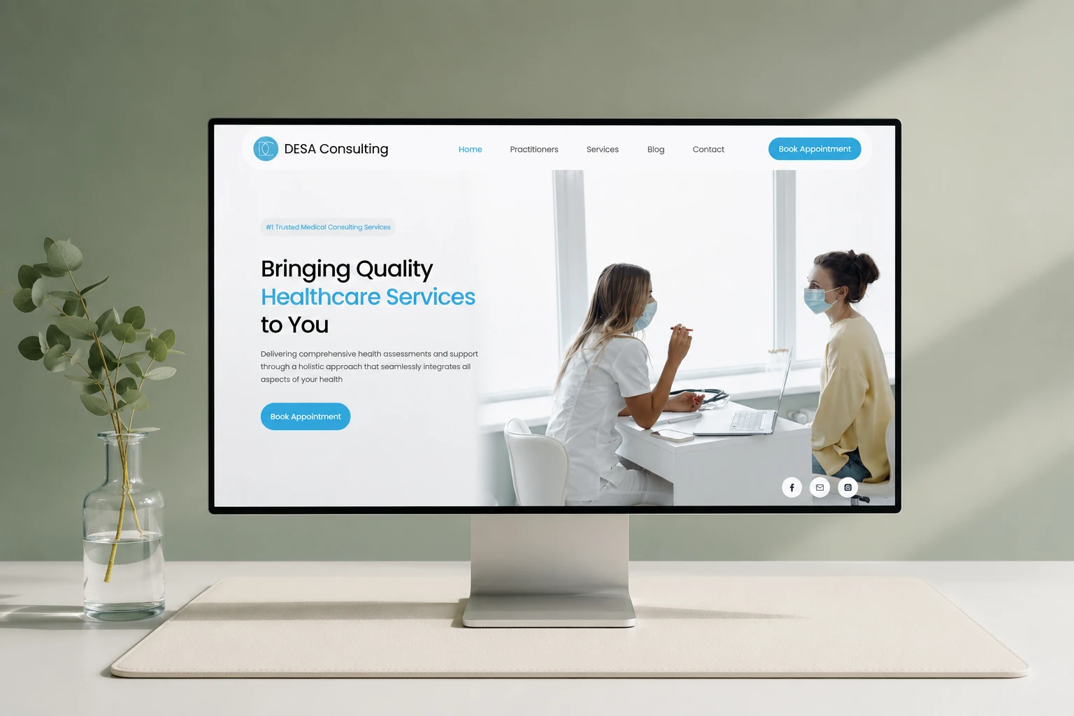
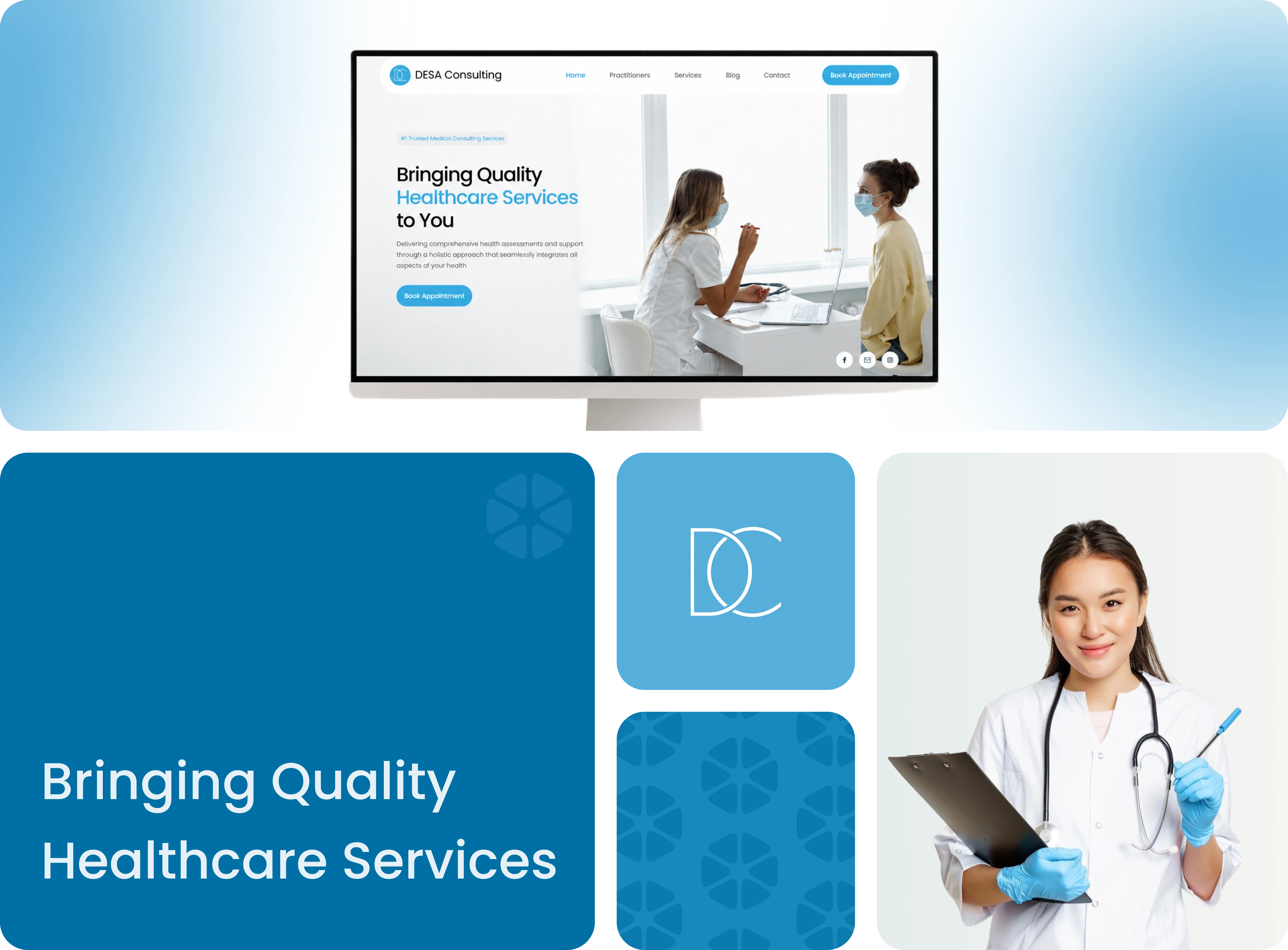
A 12-page website for a multidisciplinary medical centre in Melbourne — built to simplify how patients discover services, connect with practitioners and book appointments.
Delivered live in under three months, with online booking through HotDoc and every page written to meet Australian medical advertising compliance.
Used technologies & apps:
Project team




How We Started
This is where Wakeup Monster begins. The clients had worked with an established agency and were unhappy with the quality — so when our founder started out on his own, they left the bigger agency to work with him directly. They chose a one-person startup over an established company because they trusted the person, not the logo.
The brief: a professional website for their medical centre that represents real clinical expertise, makes services easy to discover and turns visits into booked appointments — all within Australia's strict healthcare advertising rules.
Research
Who is this website for?
Patients of a multidisciplinary medical centre, people who need to understand services, trust the practitioners and book an appointment quickly.
What already exists?
The clients had worked with a bigger agency and were unhappy with the quality, the new site had to prove a smaller team could deliver better.
What content matters most?
Services, practitioner credentials and booking. Every page had to comply with Australia's strict medical advertising standards.
Design & UI
How is the website organised?
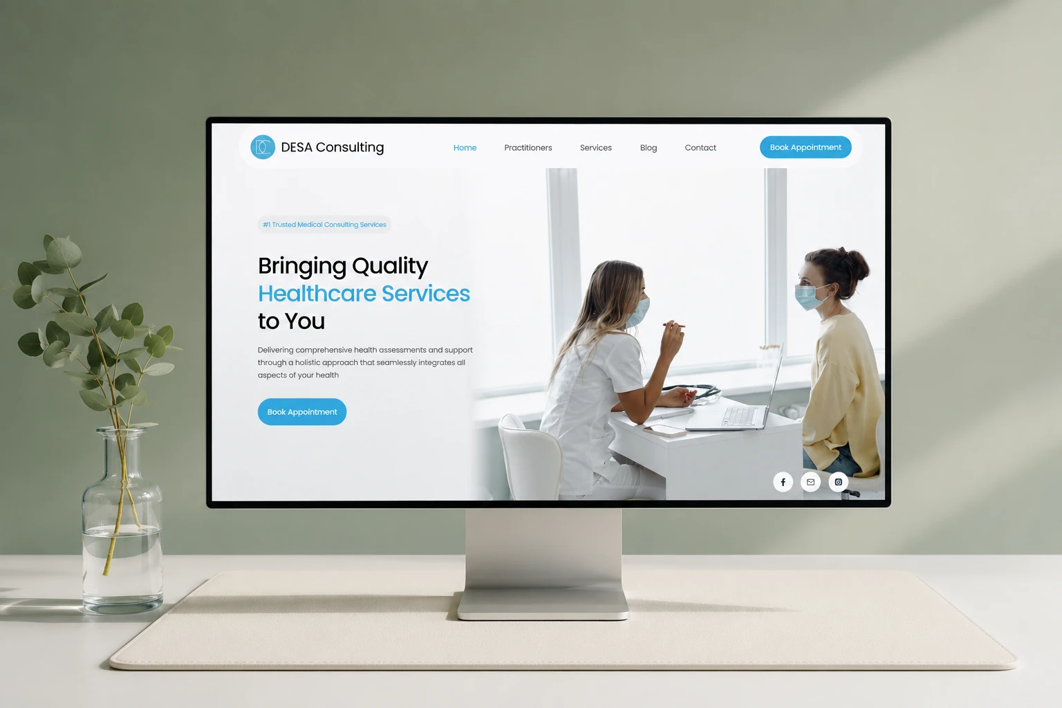
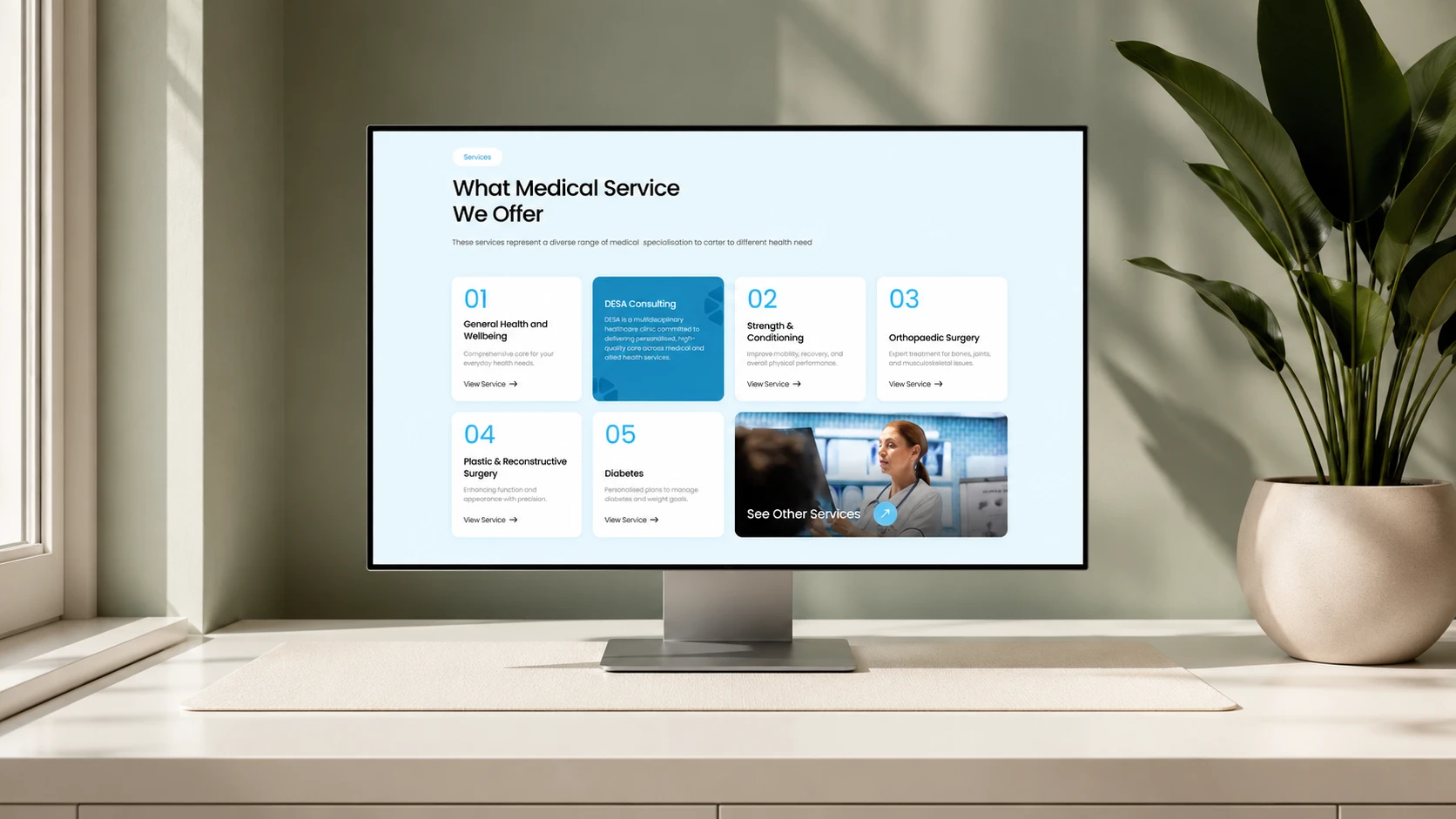
Twelve pages, home, practitioners, services, about, blog and contact, structured around how patients actually look for care.
How did the layouts evolve?
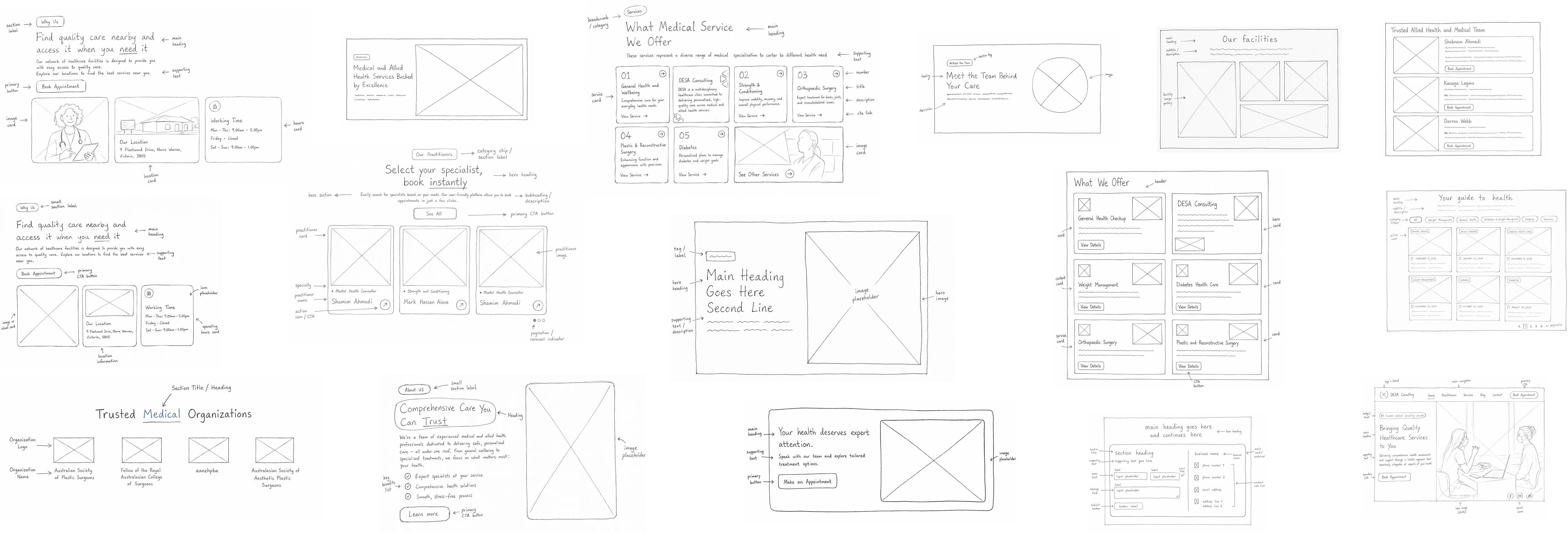
Wireframes and layout explorations for key pages, refined with the client before the WordPress build began.
What design decisions mattered most?
A calm, clinical look with booking actions visible on every page, designed to turn a visit into an appointment.
Testing & Deployment
Could users complete key tasks?
The booking journey was tested end to end, from landing on a service page to a confirmed appointment through HotDoc.
What improved after testing?
Content went through several compliance revisions to fully meet Australian medical advertising standards.
What was delivered?
A 12-page website with SEO foundation and HotDoc online booking, live in under three months and actively driving patient appointments.
Problem
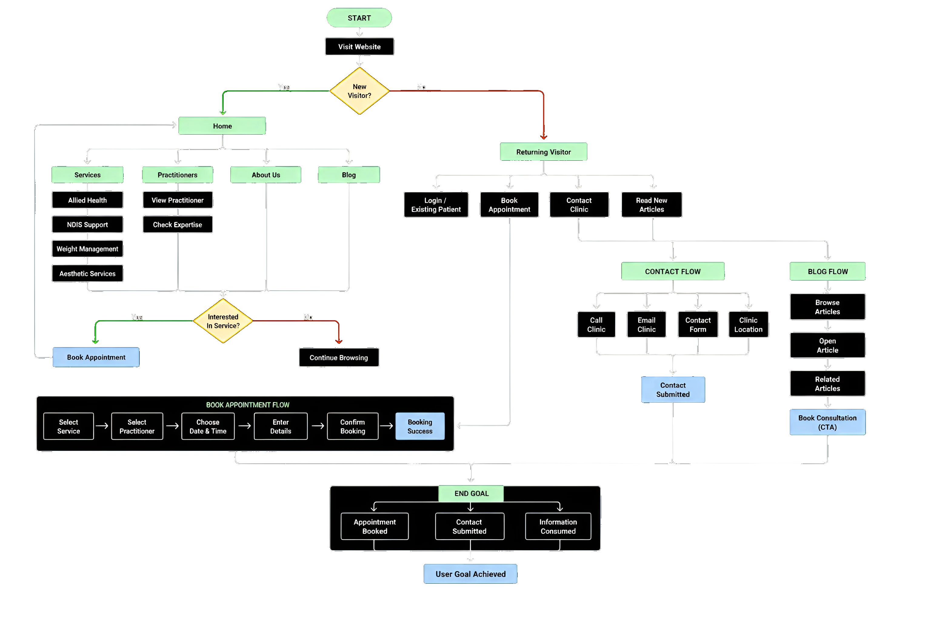
Patients often struggled to navigate healthcare information efficiently. Finding the right service, understanding practitioner expertise and locating relevant information required unnecessary effort across multiple touchpoints. The challenge was to create a more connected experience that improves clarity, strengthens trust and simplifies decision-making throughout the patient journey.
Service Discovery Challenges
Users often struggled to quickly identify which healthcare service best matched their needs, creating confusion and slowing the decision-making process.
Limited Practitioner Visibility
Patients lacked easy access to practitioner expertise, credentials and specializations, making it difficult to build trust before taking action.
Fragmented Information Architecture
Content was scattered across disconnected pages with no clear hierarchy, forcing patients to piece together information from multiple sections before they could act with confidence.
Research
The experience was intentionally structured to create a clearer relationship between healthcare services, practitioner expertise and patient actions. Every interaction was designed to reduce friction, improve accessibility and guide users toward informed healthcare decisions with greater confidence.
Design
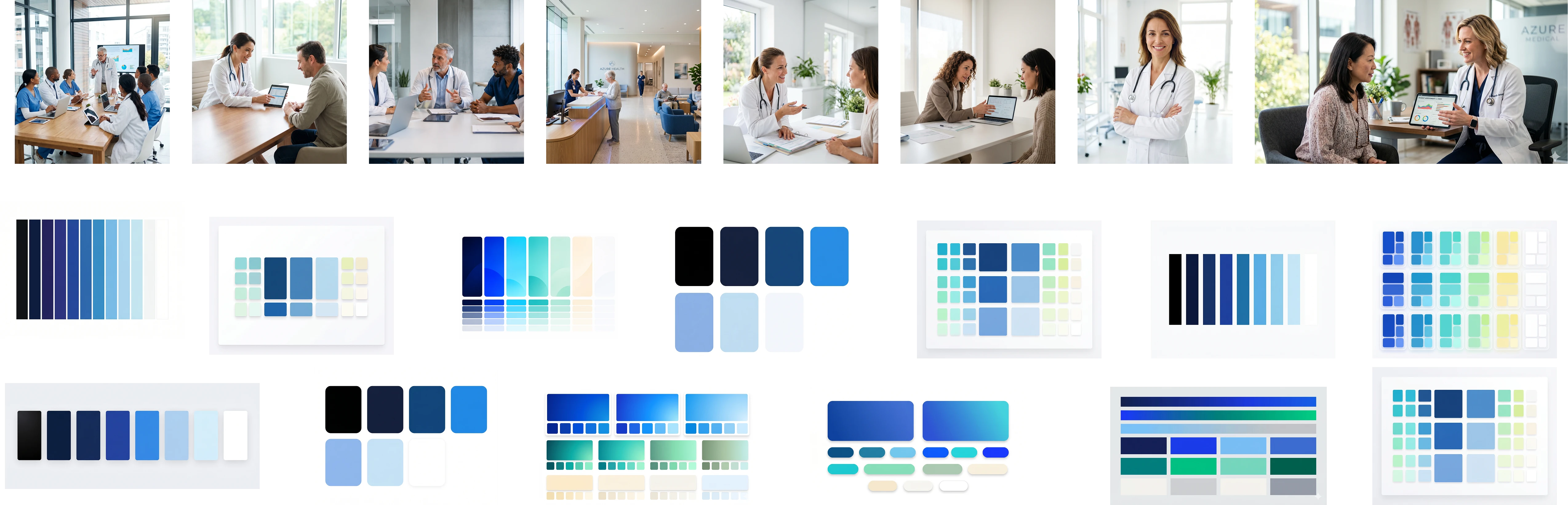
The design translates clinical professionalism into a warm digital experience — clean layouts, calm colours and a structure that guides patients naturally toward the care they need.
Design Details
The identity is built on a calm, clinical blue palette that communicates professionalism and care. Poppins brings a rounded, approachable tone to headings and body copy, while generous whitespace keeps the experience feeling clean, trustworthy and distinctly healthcare.
Challenges & Solutions
Every real project hits real walls. Here's what came up, and how we got past it.
Australian healthcare websites must comply with medical advertising standards — one wrong claim can put an entire practice at risk.
Content went through several structured revision rounds until every page met compliance — without losing the warmth patients need to feel.
A beautiful site that doesn't book patients is just a brochure.
We integrated HotDoc — Australia's leading medical booking platform — so every service page ends in a booking. The site is live and actively driving appointments.
NDIS support, orthopaedic surgery, counselling, weight-loss programs — easily overwhelming for a patient looking for help.
A 12-page architecture with a clear page per service, plus an SEO foundation so patients land on the right care straight from search.
Outcomes
This project was never just about a website — it was about proving that trust in a person can outweigh the size of an agency. The site is live, compliant and actively driving patient appointments — and the same client has since come back for a second, larger engagement.
Live & Driving Bookings
Twelve pages delivered live in under three months, with online booking through HotDoc — Australia's leading medical booking platform.
Compliance-First Content
Every page revised until it fully met Australian medical advertising standards.
A Relationship, Not a Project
Our first-ever client — still active today, and the engagement led directly to their next app project with us.
More Case Studies
Every project came through referral. Here's what else we've shipped.

Keen as Mustard
Built to serve globally, designed to deliver instantly, ready to scale without limits.
Lalah
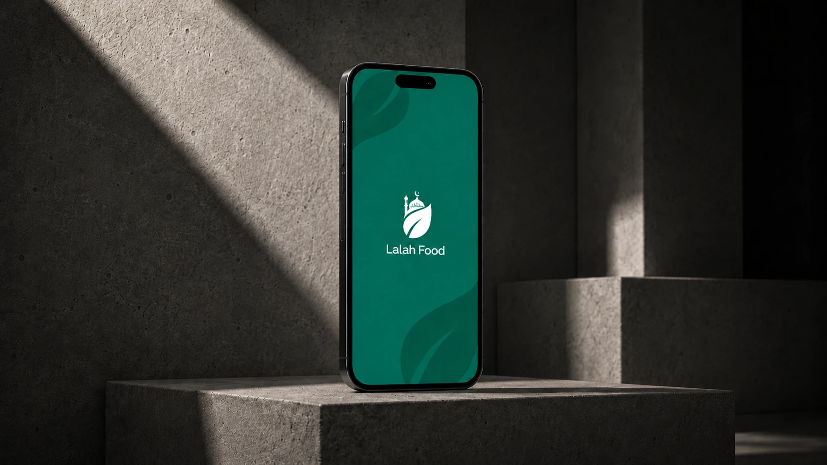
Community-driven halal food discovery platform connecting Muslims across Australia.
Got an app idea?
Let's wake it up.
Design, development, backend and marketing, one team, one point of contact, from first call to launch.