

Interior Three Sixty
A healthcare-focused digital platform designed to simplify how patients discover services, connect with practitioners and access trusted medical information.
The experience was built to reduce friction, improve accessibility and create greater confidence throughout the patient journey.
Used technologies & apps:
Project team




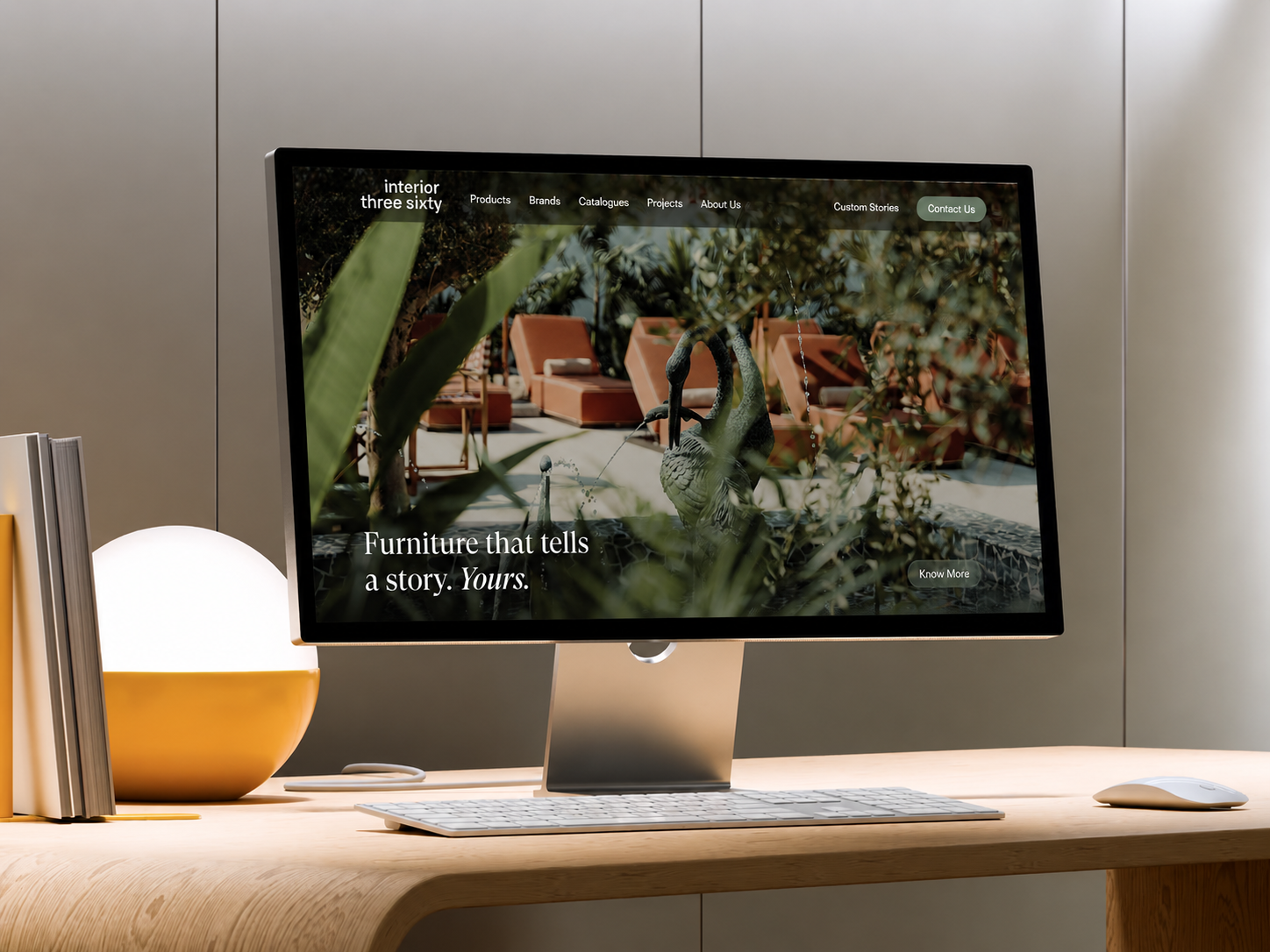
How We Started
Healthcare decisions are often made during moments of uncertainty. Patients need clear information, trustworthy guidance and quick access to the right services. However, fragmented content structures and outdated digital experiences can create unnecessary friction.
The objective was to create a platform that better represents professional expertise while making healthcare services easier to discover, understand and access.
Research
Who is this website for?
Define the target audience, their goals, needs, and expectations.
What already exists?
Review similar websites and identify opportunities for improvement.
What content matters most?
Identify the information users need most and how they access it.
Design & UI
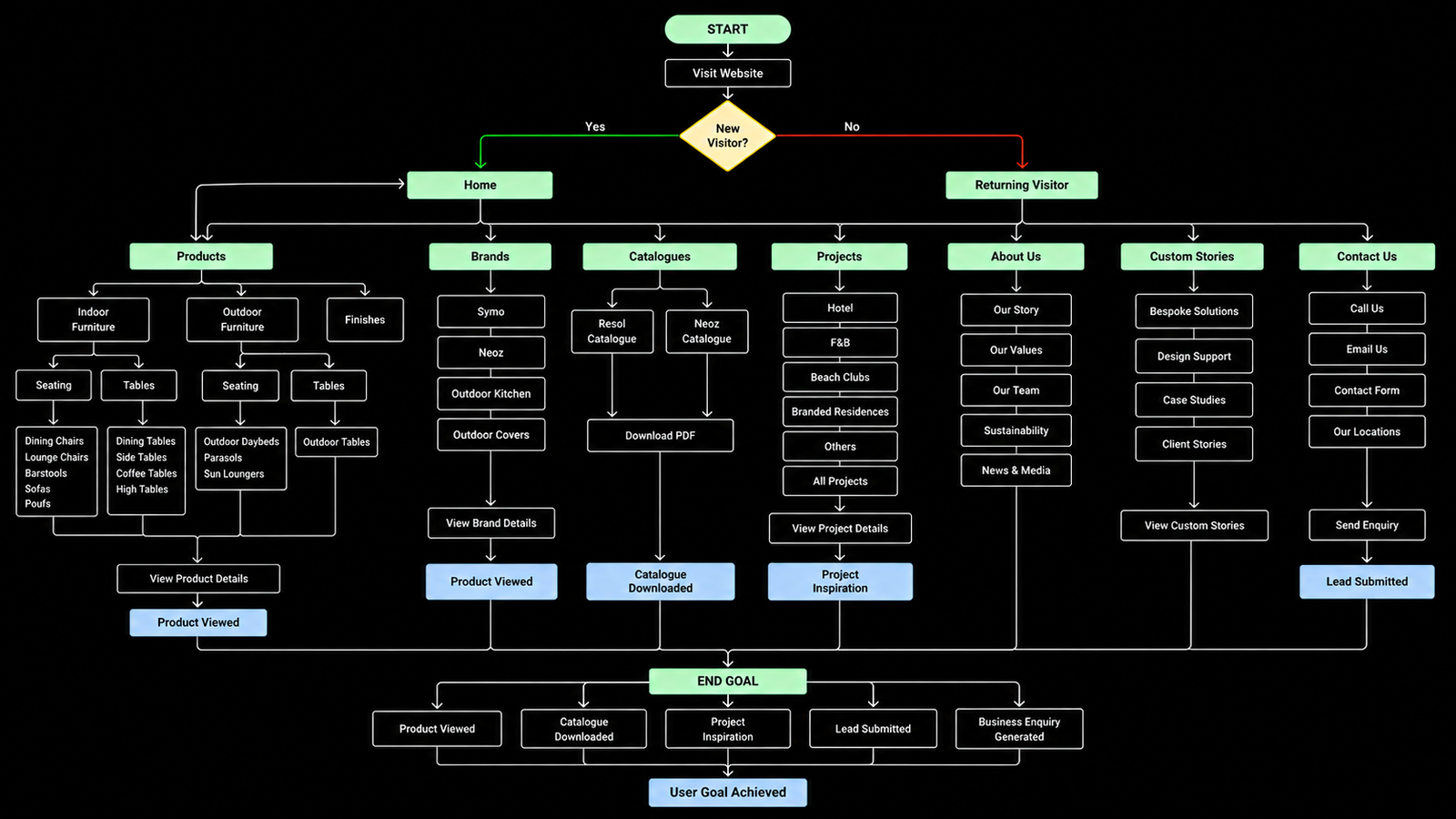
How is the website organized?
Pages, navigation structure, and content hierarchy.
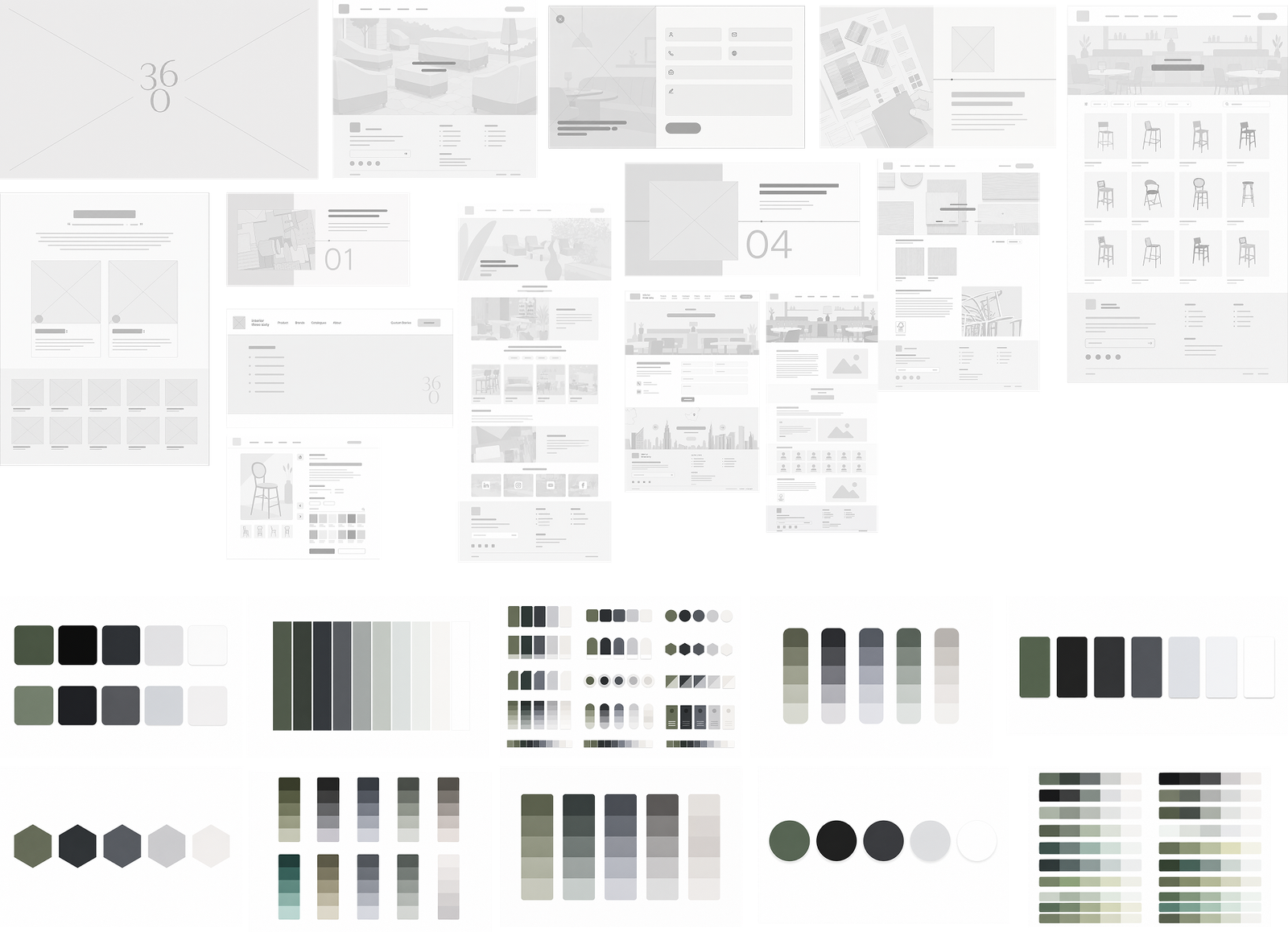
How did the layouts evolve?
Wireframes and early layout explorations for key pages.
What design decisions mattered most?
Key choices that improved usability, clarity, and conversions.
Testing & Deployment
Could users complete key tasks?
Usability testing results and navigation effectiveness.
What improved after testing?
Feedback received and the design changes that followed.
What was delivered?
Completed pages, features, and current project status.
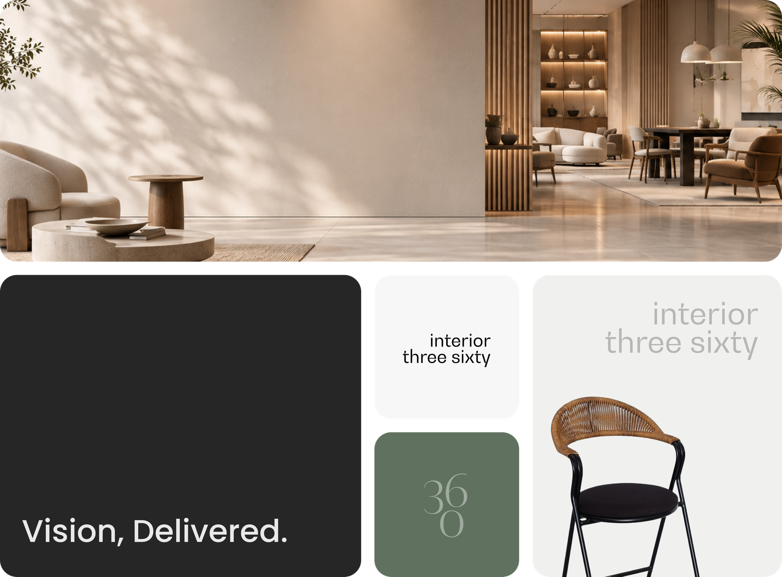
Problem
Patients often struggled to navigate healthcare information efficiently. Finding the right service, understanding practitioner expertise and locating relevant information required unnecessary effort across multiple touchpoints. The challenge was to create a more connected experience that improves clarity, strengthens trust and simplifies decision-making throughout the patient journey.
Service Discovery Challenges
Users often struggled to quickly identify which healthcare service best matched their needs, creating confusion and slowing the decision-making process.
Limited Practitioner Visibility
Patients lacked easy access to practitioner expertise, credentials and specializations, making it difficult to build trust before taking action.
Fragmented Information Architecture
Travellers and local communities regularly discovered halal-friendly locations that weren't listed on existing platforms, leaving valuable information unavailable to others.
Research
The experience was intentionally structured to create a clearer relationship between healthcare services, practitioner expertise and patient actions. Every interaction was designed to reduce friction, improve accessibility and guide users toward informed healthcare decisions with greater confidence.
Design
Design Details
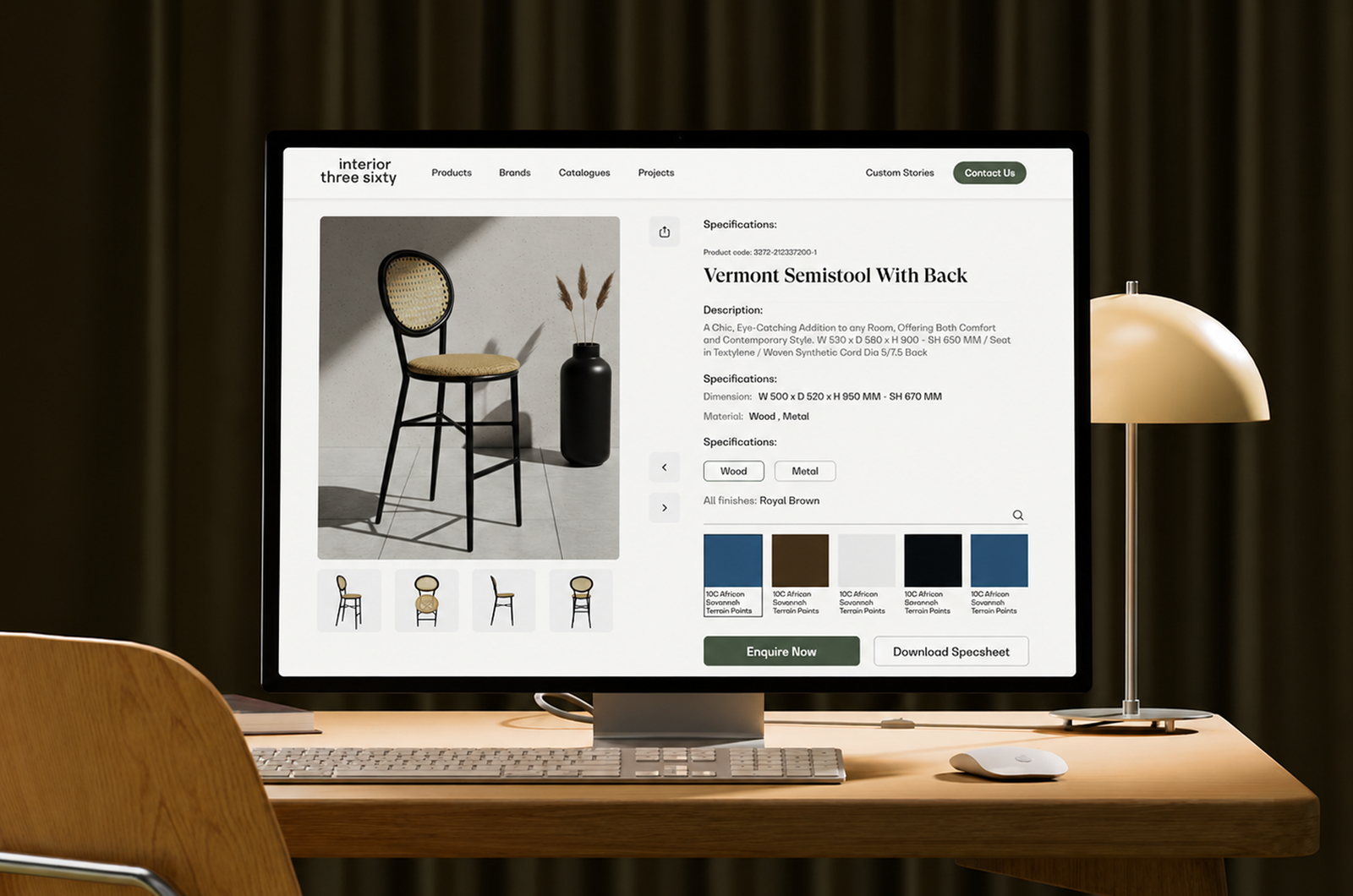
The logo follows a modern and minimal visual style that aligns with the brand identity. A balanced color palette is used to create a clean and professional appearance, while the primary brand colors help maintain strong visual recognition. The typeface is a modern sans-serif font chosen for its clarity, readability, and consistent look across the overall design system.
More Case Studies
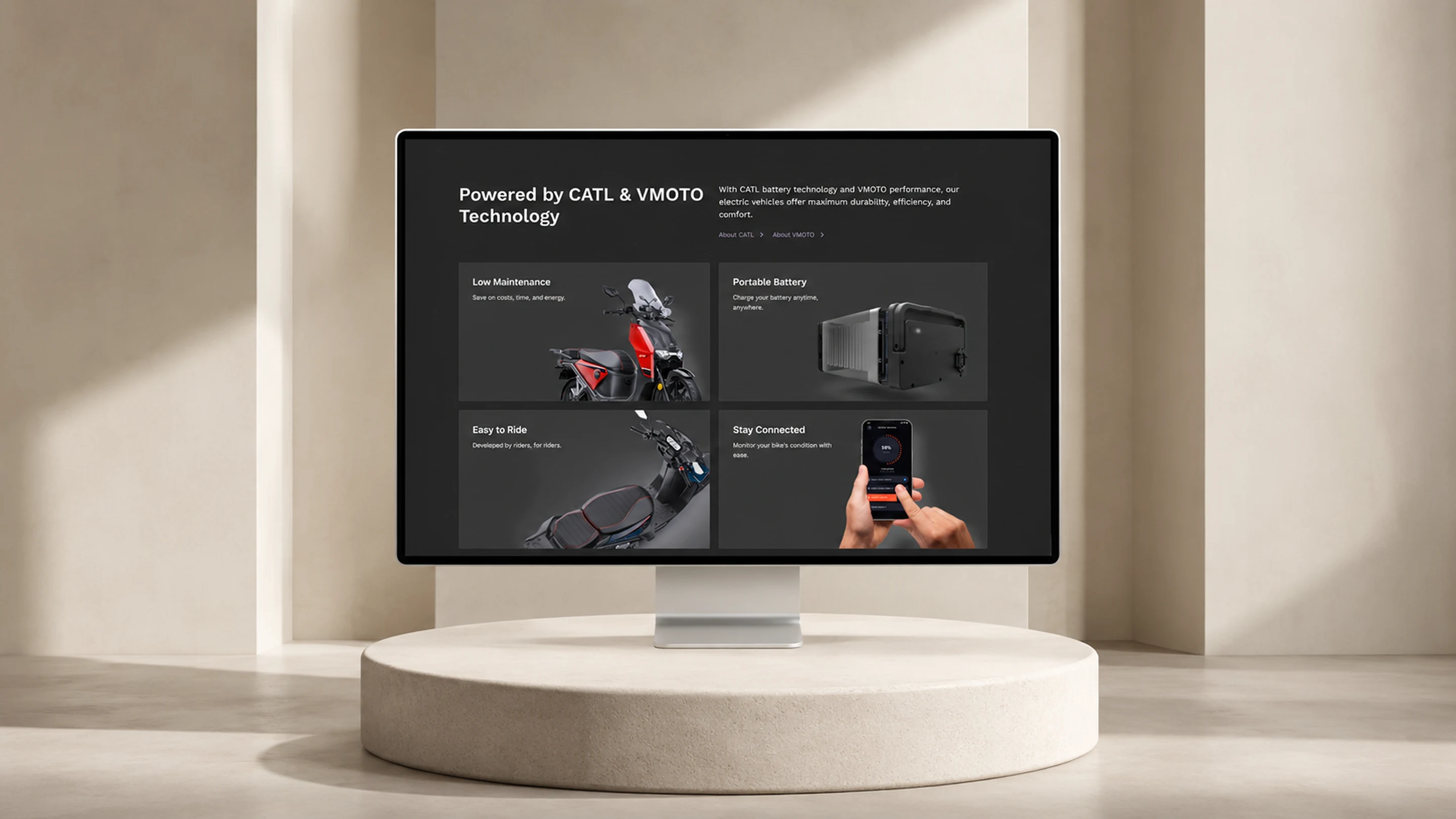
Every project came through referral. Here's what else we've shipped.

Keen as Mustard
Built to serve globally, designed to deliver instantly, ready to scale without limits.
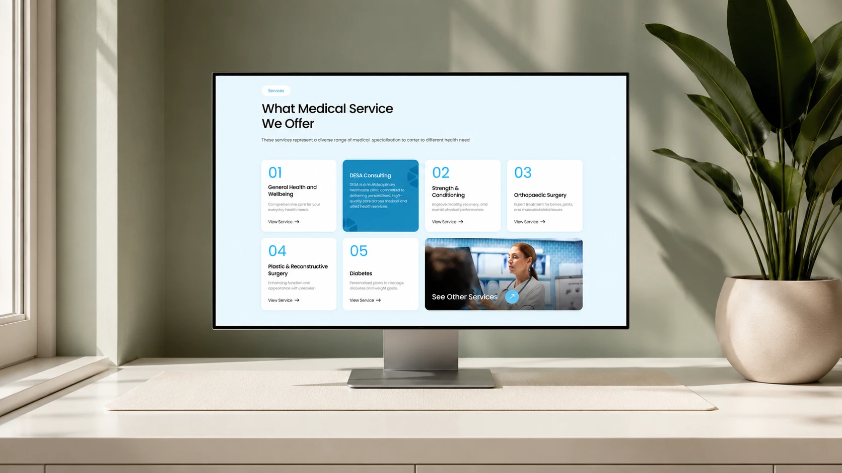
DESA Consulting
A multidisciplinary healthcare website built for patient clarity and online booking.
Got an app idea?
Let's wake it up.
Design, development, backend and marketing, one team, one point of contact, from first call to launch.