

How to Build a Map-Based App: Notes From a Flutter Build
The map is the easy part. Most of the work in a discovery app sits in the list, the permissions and the data behind it.
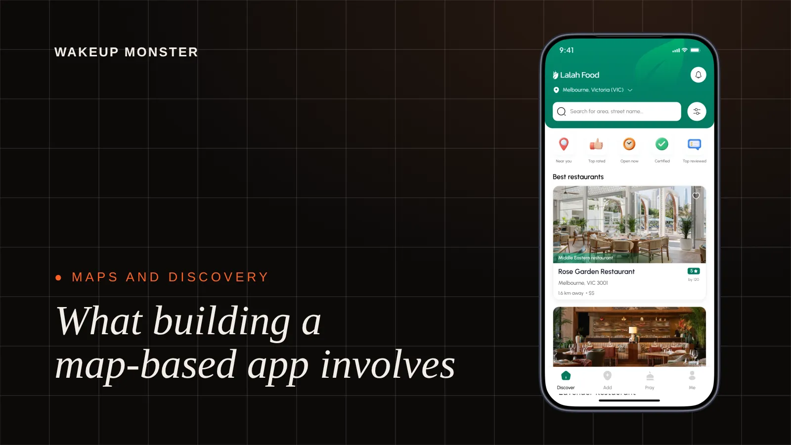

Indore, 1 November 2026, I want to write down what goes into a map-based discovery app, because founders often describe one as "a map with pins on it" and then get surprised by the rest. The example I know best is Lalah, a halal food discovery app we built for a founder in Melbourne. I built the Flutter app myself, so a lot of this comes from my own screen.
Some context first. Lalah helps Australia's Muslim community find halal restaurants. It is a discovery app, not food delivery. It has a Google Maps map view and a list view, restaurant pages with photos, menu and reviews, one-tap directions and calling, location-based prayer times, user profiles and community submissions that an admin reviews before they go public. The Flutter app talks to a Node.js backend on AWS, with Firebase handling analytics and push notifications. A team of five built it in four months, around 40 screens in total. Development is complete. The launch is on hold because the client's investor pulled out, so I can talk about the build but not about users.
The map is not the main screen people use
This is the thing I would tell any founder planning a map app. The map looks great in a pitch deck. It is also a poor way to compare places.
On a map you see pins. To learn anything about a pin you tap it, read a small card, close it, tap the next one. That works when you are exploring a suburb you don't know. It works badly when you are hungry and want the five closest places sorted by distance. For that, people want a list: names, distance, a photo, maybe a category, all scannable with one thumb.
So Lalah has both, and I would build both again. The map answers "what is around me". The list answers "which one should I pick". They should show the same results, driven by the same filters and the same search area, so switching between them never feels like moving to a different app.
If the first version only has room for one of the two, I would argue for the list and add the map later. Plenty of founders would disagree, which is fair. It is their product.
Google Maps integration in a Flutter app
On the technical side, putting Google Maps into a Flutter app is well-trodden ground. Google maintains an official Flutter plugin, you get an API key from a Google Cloud project, restrict that key to your app, and render the map as a widget.
The time goes into everything around it. A few things I would plan for from the start:
- Markers need a design. Default red pins look like a demo. Custom markers that match your brand, plus a clear selected state, make the map feel finished.
- Load places for the visible area only. When the user pans or zooms, ask the backend for what is inside the new bounds, and wait until they stop moving before you fire the request.
- Decide what happens when many pins overlap in one spot. Either group them at low zoom or limit how many you show, but decide it in design, not after testers complain.
- Keep the map and the list on one shared state, so a filter applied in one shows up in the other.
Most of the real logic lives on the server, not in the app. Finding places near a point, sorting them by distance and applying filters is backend work. That is why I treat a map app as a backend project as much as a mobile one. The app draws what the API sends it.
Asking for location at the right moment
Location permission is where many map apps lose people in the first minute. The common mistake is asking on the very first screen, before the user has seen anything. iOS and Android both show a system prompt, and you usually get one clean shot at it. If the person taps "Don't allow" on a cold prompt, getting them back means sending them to the phone's settings, and few will bother.
The better moment is when the app can show why it needs location, for example when the user opens the map or taps a "near me" option. A short screen of your own before the system prompt helps too, one line on what location will be used for. In a halal food app the reasons are easy to explain: nearby restaurants, and prayer times for where you are. People are more likely to say yes when the reason is obvious.
Ask for the smallest permission that does the job. A discovery app needs location while it is open. It does not need background location, and asking for it invites both refusals and harder questions from app review.
When the user says no
Some people will deny location. The app still has to work for them, and this is the part that gets skipped most often.
A denied permission should never leave someone on an empty map centred on the ocean. Give them another way in. Let them search for a suburb or postcode, or pick a city, and show results for that area. Keep a small, polite banner that explains they can turn location on for nearby results, with a button that opens the right settings page. Don't nag on every launch.
Location-based prayer times are a good example of a feature that has to degrade gracefully, because they depend entirely on where the user is. My view is that without device location they should fall back to the area the user searched or chose, and say clearly which place the times are for. A wrong time shown with confidence is worse than a right time with a label on it.
Test the denied path on purpose. In QA, deny the permission, revoke it halfway through a session, turn off location services for the whole phone. Each is a different state that needs a designed screen.
Keeping place data fresh with community submissions
A discovery app is only as good as its data. Restaurants open, close, change menus and move. No small team can keep up with that by hand across a whole country, and that is why Lalah lets the community submit restaurants.
Open submissions bring their own problem: anyone can submit anything. So in Lalah, every submission is reviewed by an admin before it is published. Nothing a user sends goes straight onto the map. I think that is the right default for any app where people make decisions based on the listing. A halal food app in particular cannot afford a listing that turns out to be wrong.
If you are designing this, think through the whole path of a submission. What fields does the user fill in, and which are required? How does the submitter know it is pending and not lost? What does the admin see, and can they edit a submission before approving it rather than rejecting it over a typo? What happens to duplicates of a place that already exists? Writing these out as user stories before design saves a lot of rework.
The admin panel is half the product
Lalah has a React and Node.js admin panel alongside the app, and it is where those submissions get reviewed before anything is published. On any map app, the admin side is also where listing details get corrected and where someone fixes a pin that landed in the wrong street.
Founders tend to picture the app and treat the admin side as a settings page. In practice the person running the platform will spend more hours in the admin panel than in the app. A slow review queue means a stale map. So give it the same design attention: a clear queue of pending items, a preview of how a listing will look in the app, quick edit and approve actions, and a way to see a place on a map before it goes live.
Slow networks and no network
People use discovery apps out and about, which means patchy mobile data, basements and car parks. A map app that shows a blank grey grid with no message during a slow load feels broken even when it is only waiting.
I would design these states up front: a loading state for the map and list that shows something useful (skeleton rows, the last results you had), a clear message when the network drops, and a retry that does not throw away what the user was doing. Images on restaurant pages should load progressively, so the name, address, directions and call buttons appear before the photos do.
None of it shows in a demo on office wifi. It shows up the first time someone opens the app on a train.
What I would plan differently
If I were scoping another map-based app tomorrow, I would put the list view, the denied-location path and the admin review queue in the first round of Figma designs, next to the map, rather than letting the map get all the early attention. The map is what gets shown in the pitch. The other screens decide whether anyone trusts the app.
The full scope of Lalah is on the Lalah project page. If you are planning a restaurant or place discovery product, our page on food discovery app development covers how we would approach it.
Questions we get about this
How do you build a map-based app?
Start with what users need to find and compare, then design the map and a list view together on shared filters. Plan the backend that finds places near a point, the location permission flow, a fallback for users who deny location, and an admin panel to keep place data accurate. The map widget itself is a small part of the work.
Can Google Maps be used in a Flutter app?
Yes. Google maintains an official Flutter plugin for Google Maps. You create an API key in a Google Cloud project, restrict it to your app, and render the map as a widget. Lalah, the halal food discovery app we built, uses the Google Maps API in its Flutter app for the map view, alongside a list view and a Node.js backend on AWS.
What should a map app do if the user denies location access?
Keep working. Let the user search for a suburb, postcode or city and show results for that area, with a polite option to turn location on later. Features that depend on location, such as nearby results or prayer times, should fall back to the chosen area and say clearly which place they apply to.
Is Lalah available in the app stores?
Not yet. Development of Lalah is complete and the app is ready for launch, but the launch is on hold because the client's investor pulled out. The build covered a Flutter app for iOS and Android, a React landing page, a React and Node.js admin panel and a Node.js backend on AWS.